The Brief
Context
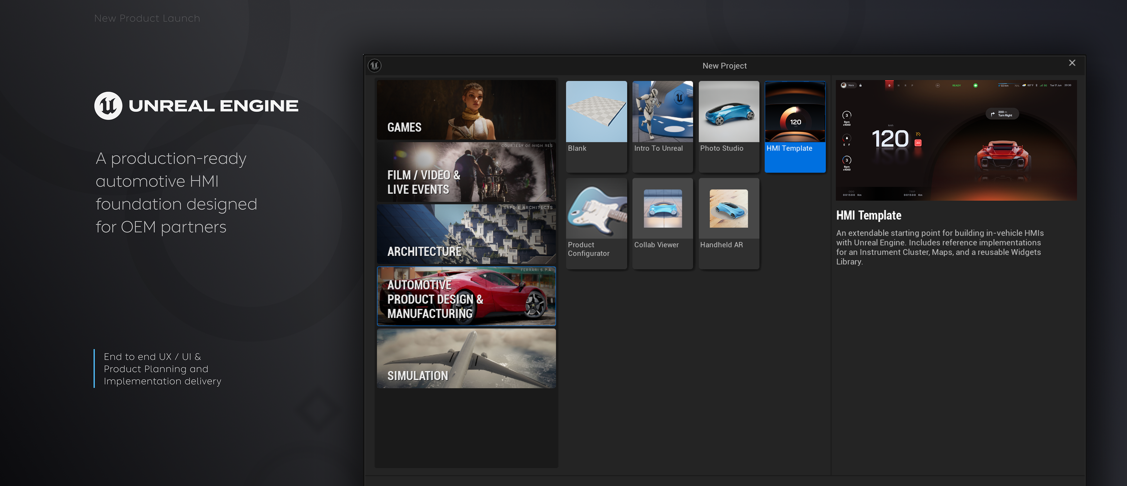
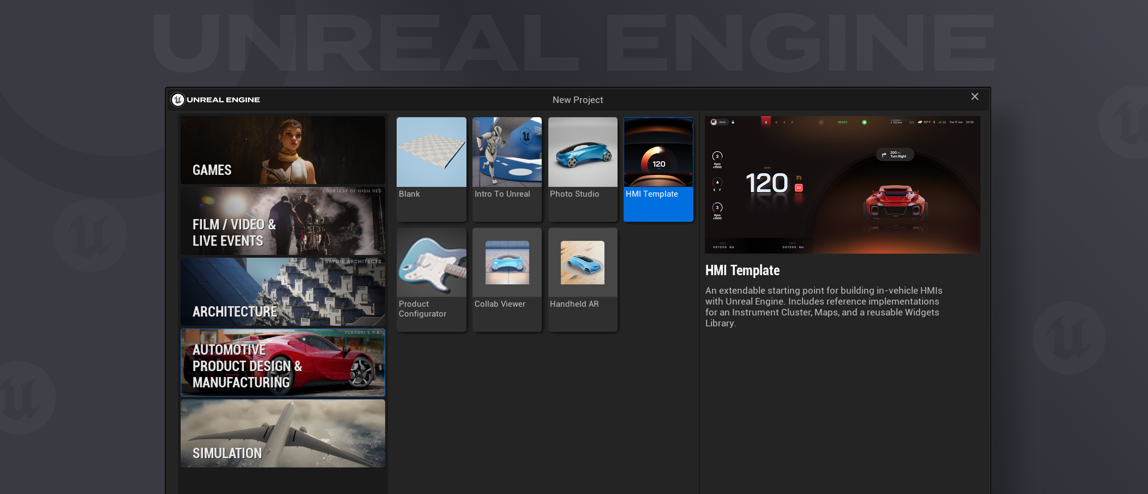
Automotive OEMs exploring Unreal Engine for in-vehicle HMI had no starting point. Every team began from a blank canvas inside a game engine — unfamiliar tooling, no automotive conventions, no reference for how an instrument cluster or map system should be structured in UE5.
Deliverable
Epic Games needed a reusable, production-ready template that partners could pick up, customise, and use as the foundation for their own HMI development — removing weeks of groundwork and demonstrating what was possible in the engine.
Role
I was brought in to design and conceive the full template: the visual language, the UX architecture, the component structure, and all interaction states. The technical build in Unreal Engine was handled by the engineering team — my job was to define exactly what they were building and why.
Art Direction · UX Design · Interaction Architecture · Component Design · Vendor Direction

What made this different
The Constraints
This wasn't a web or app canvas. Every design decision had to work within Unreal Engine's blueprint system — a real-time rendering environment built for games, not automotive interfaces. That meant thinking about performance, signal architecture, and state management from the very first screen.
The template also had to serve many different OEMs simultaneously — each with their own brand, vehicle type, and technical maturity. The design had to be opinionated enough to be useful, but flexible enough not to dictate the end product.
We decided to create three components. The Cluster screen, Maps and a widget library that would essentially act as the base for all additional features that the user could resource from.
Designed for blueprint logic
Every component was conceived with UE5's visual scripting system in mind. Layout, states, and transitions had to map cleanly to how the engine handles real-time data — not how a design tool does.
Live vehicle signals, not static data
The cluster had to respond to actual vehicle data — speed, charge state, gear, warning signals — not placeholder numbers. Every state needed to be designed and documented.
Offline map requirements
Navigation had to work without a live data connection — a hard requirement for many automotive testing environments. The map experience was designed around offline-first interaction.
Must work across OEM contexts
The template would be handed to partners with wildly different vehicles, brands, and technical setups. Modularity wasn't a nice-to-have — it was the whole point

Discipline Over Completeness
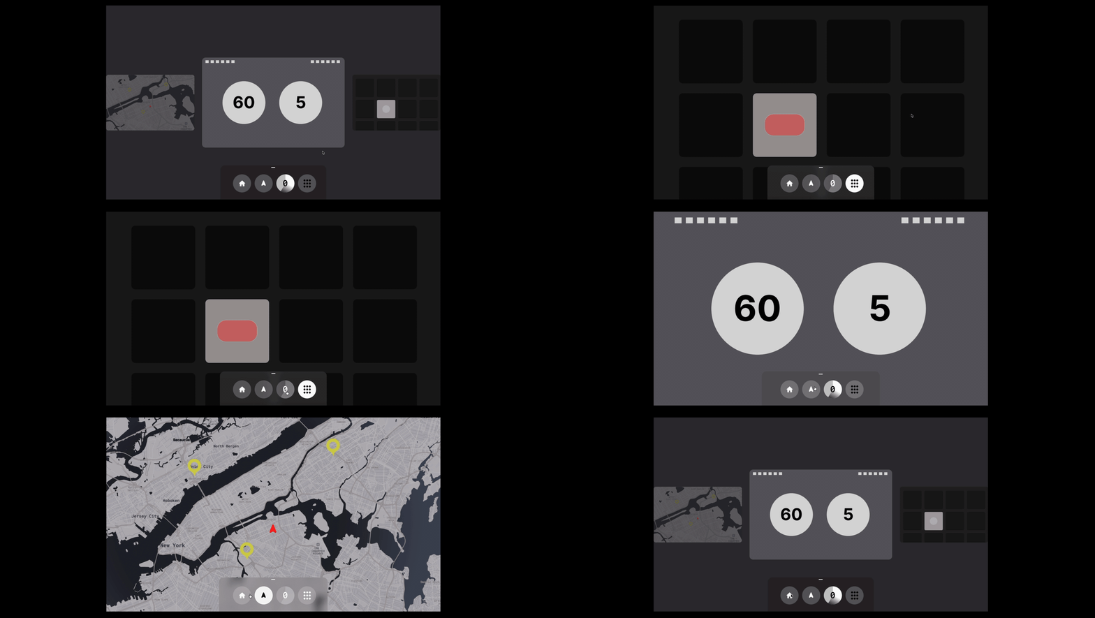
The original brief had five features scoped for the first release. The UX was built around that — a bottom navigation bar designed to hold all five destinations, with a carousel home state that let you preview each one before diving in.
As the programme progressed, the decision was made to focus the first deliverable on three: the cluster, the map, and the widget library. Everything else would follow. The navigation bar came out with it — five destinations justifies a persistent nav, three doesn't. With a tighter feature set, the smarter call was to let each component breathe and remove the overhead of a navigation system that was solving a problem that no longer existed.
It's a decision that sounds simple in retrospect but takes discipline in practice. Shipping three things well is harder than shipping five things adequately.
Digital Instrument Cluster
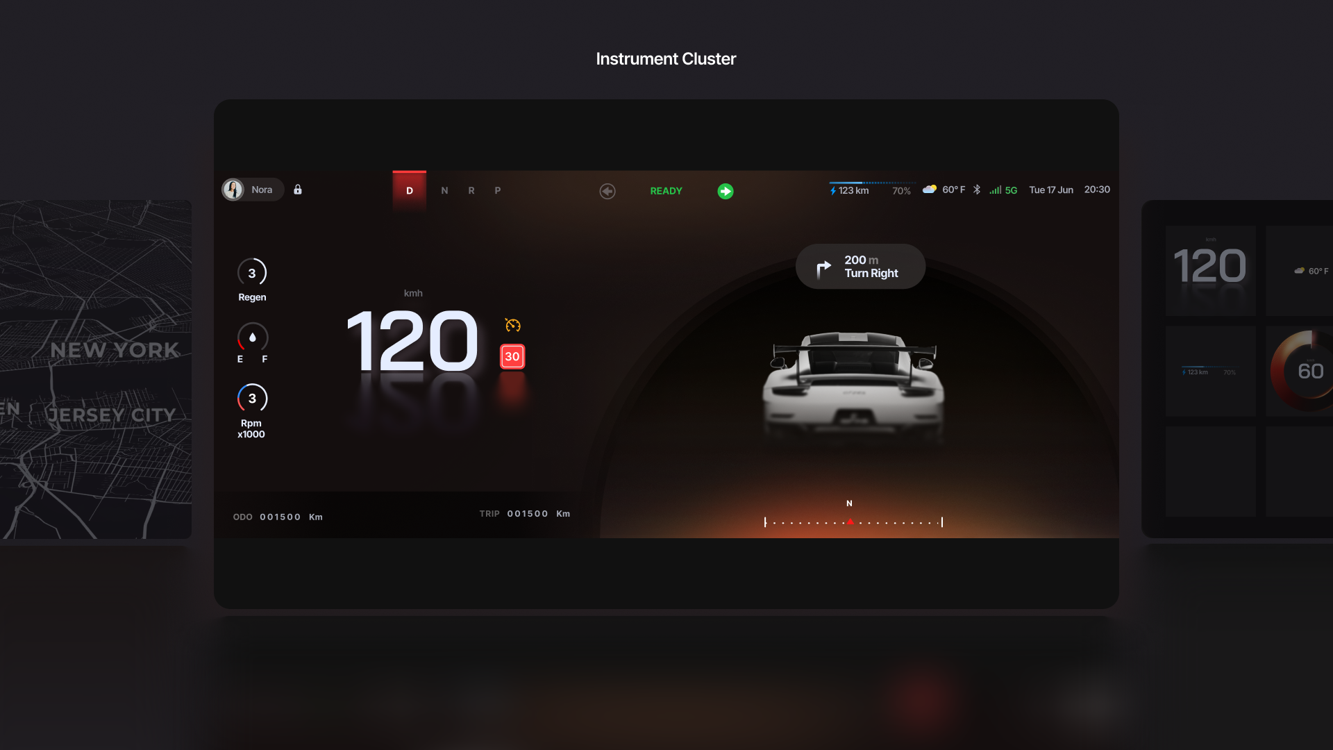
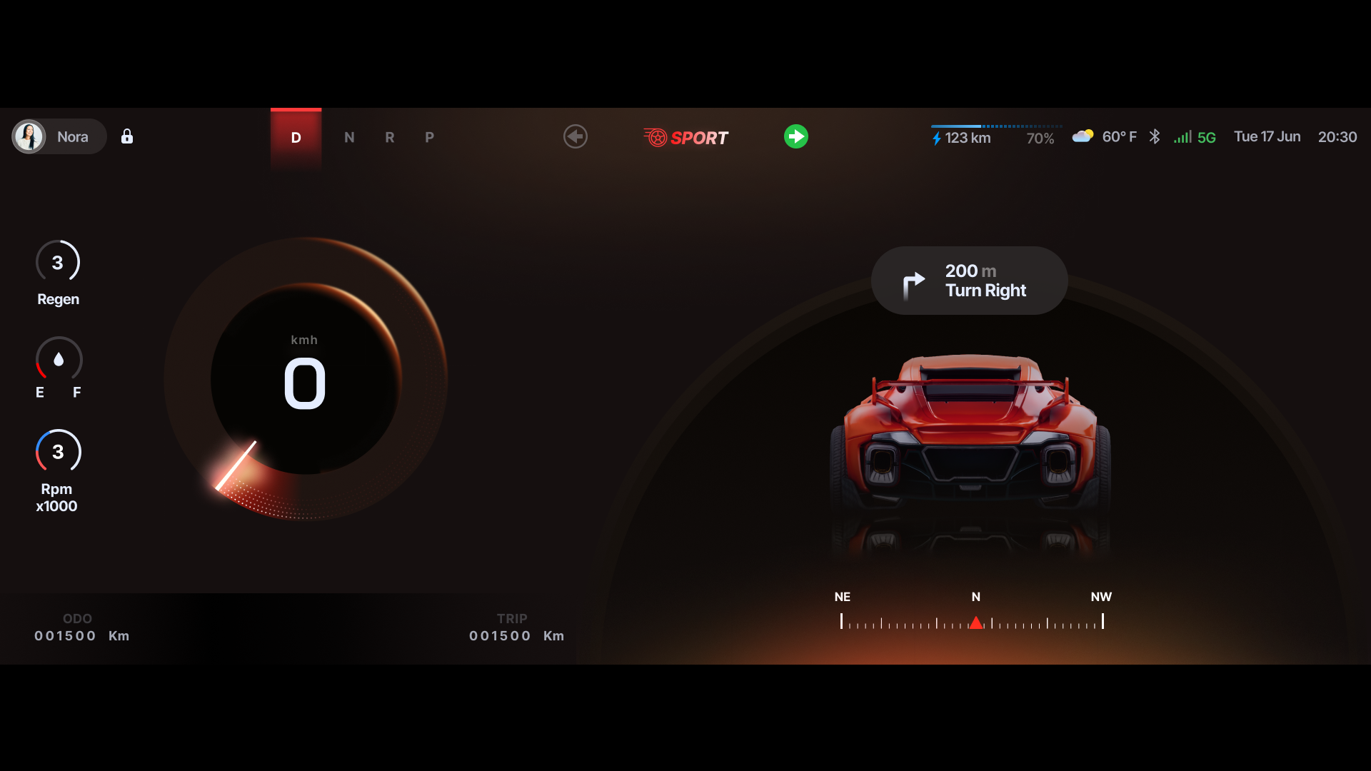
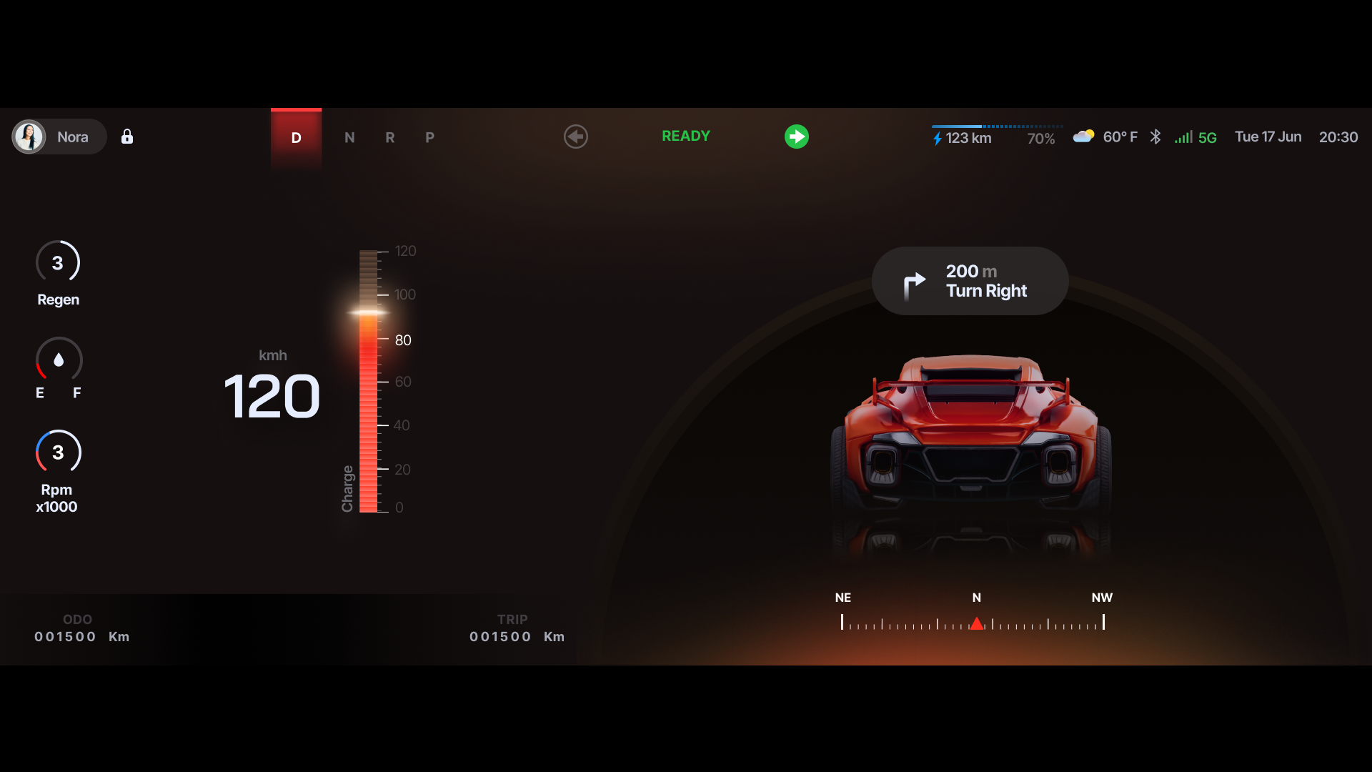
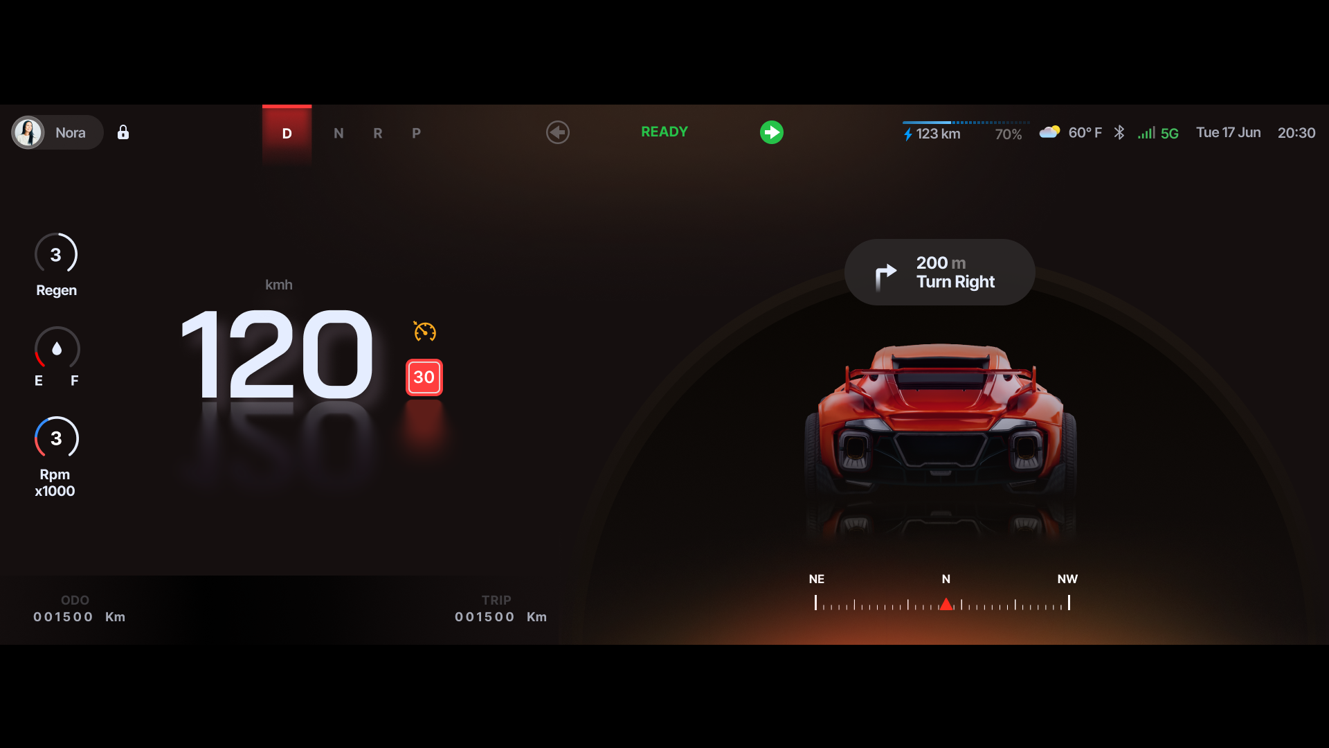
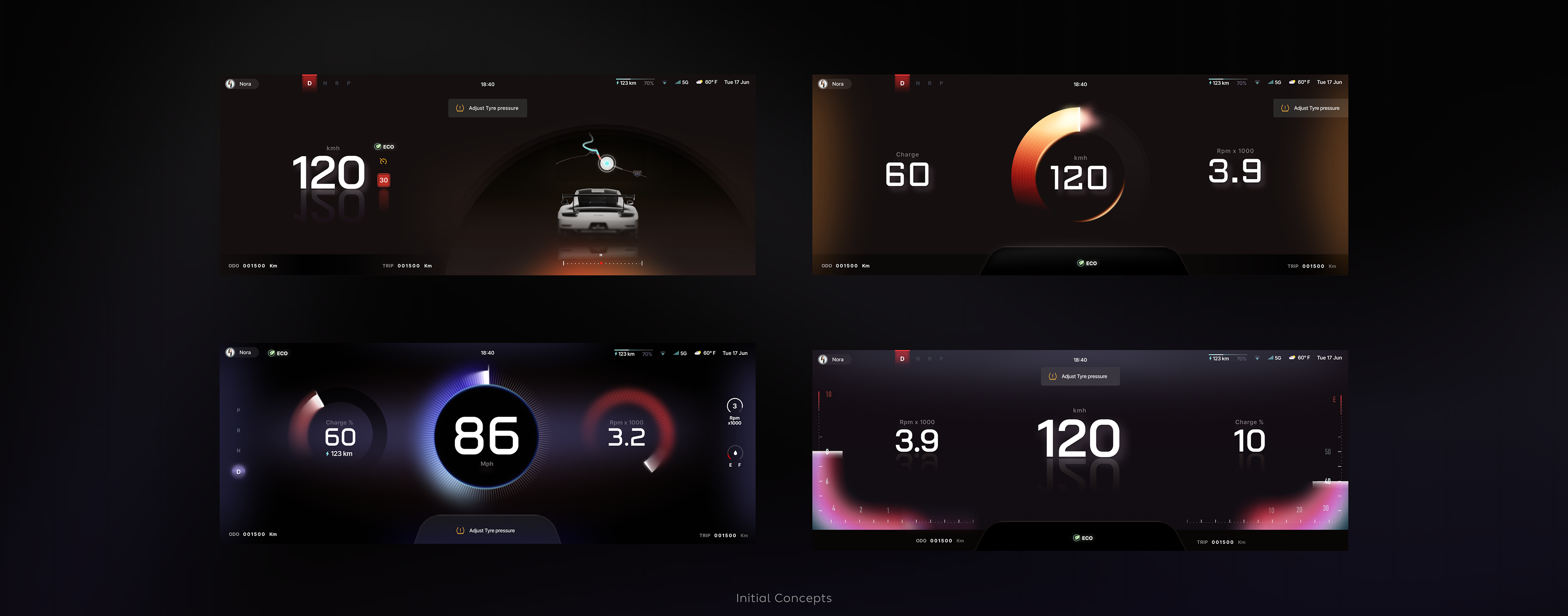
A fully wired digital instrument cluster connected to live vehicle signals. Speed, state of charge, gear position, driver alerts, regenerative braking, range — all designed as a coherent information system, not a collection of individual dials.
The cluster was designed to handle multiple driving modes and vehicle states — from a calm ambient display at low speed to a higher-information performance state — with transitions between them that felt intentional, not jarring.
High-Performance Offline Map
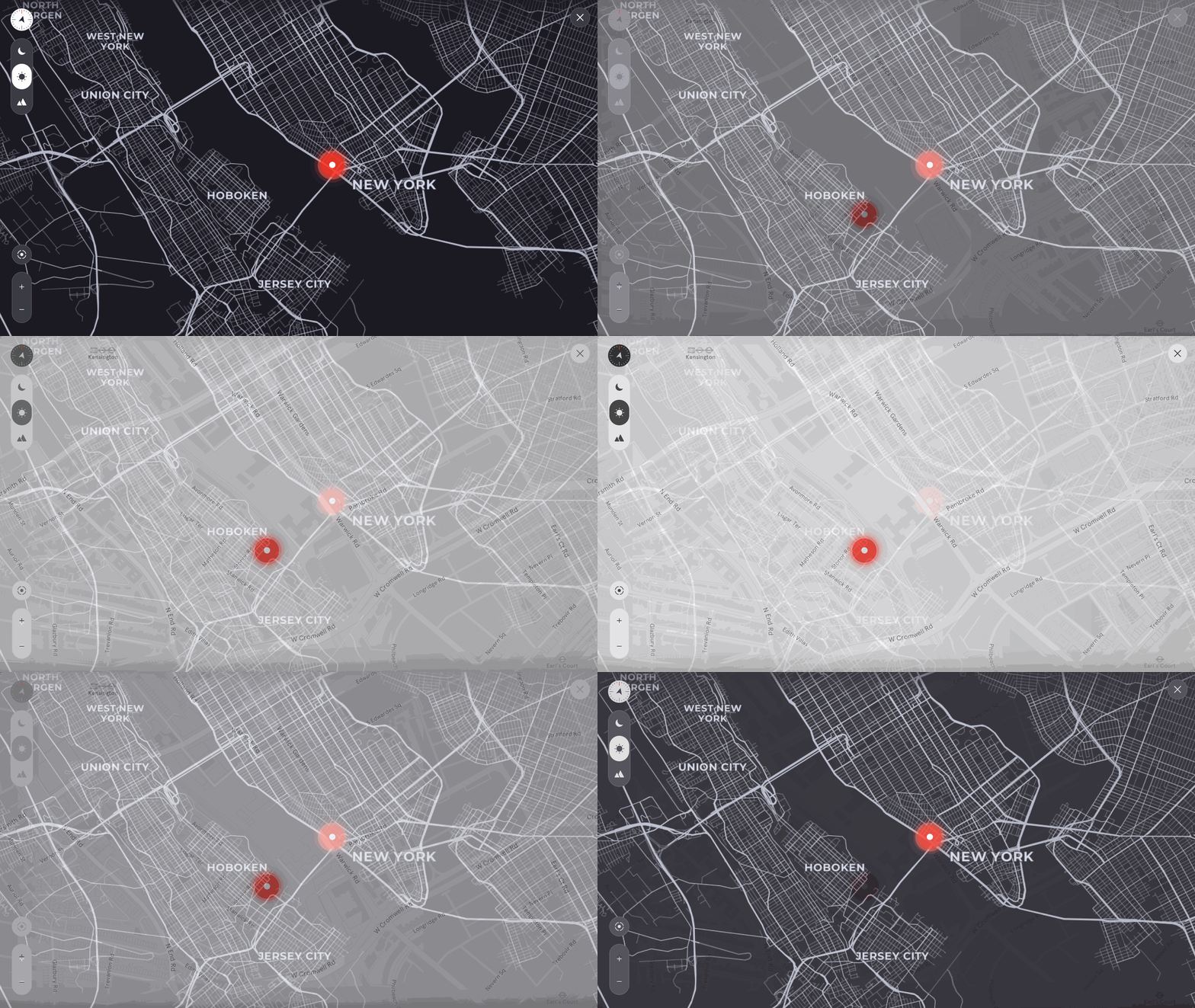
A full navigation experience designed to work without a live data connection. The map renders high-quality tiles locally inside UE5 — giving OEM partners a navigation surface that works in controlled testing environments, development labs, and early vehicle programmes where live connectivity can't be guaranteed.
The design had to feel like a finished navigation product — not a placeholder. Route display, POI representation, turn indicators, and ETA — all designed as part of the system, not bolted on.
A Modular Widget Library
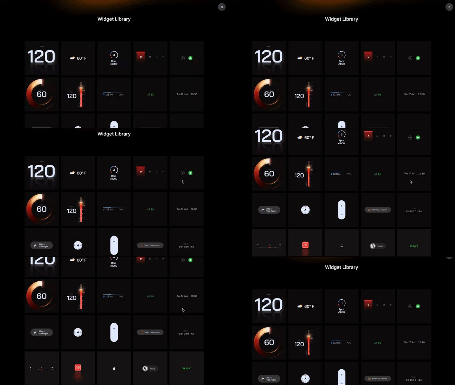
A library of pre-built, customisable UI components that OEM partners can use to populate their HMI experience. Rather than designing every screen from scratch, teams can pull from a consistent set of widgets — media, climate, vehicle status, notifications — and arrange them across their surfaces.
Every widget was designed with two states in mind: how it looks as part of a full interface, and how it looks in isolation when a partner is evaluating it for their own use. The library had to be self-explanatory — documentation through design.
Key Calls
What I chose and Why
Designed to be replaced, not kept
The template's visual language was intentionally neutral — strong enough to feel finished, restrained enough not to fight an OEM's brand. The goal was to give partners a foundation they'd want to build on, not one they'd need to strip back entirely.
State-first, not screen-first
Every component was designed around its states before its appearance. What does the cluster show at 0 km/h? At 120? During a warning? Designing states first meant the visual language emerged from real functional requirements, not aesthetic preferences.
Maps designed to blend into any brand
The map palette was kept deliberately neutral — a clean light mode and a restrained dark mode, both stripped of any strong colour identity. Automotive departments have strict brand and readability requirements; a map that arrives with its own aesthetic creates friction. By keeping both modes minimal and legible, OEM teams can drop their own colour logic on top without fighting what's already there. It also demonstrates something important about Unreal Engine's capability: switching between light and dark is seamless, real-time, and requires no re-engineering — just a design decision.